 |
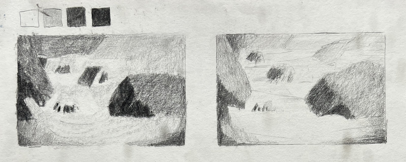
| Two pencil value studies, with a four-value scale. |
| Last week's article ended with a promise: once the edges of a painting are chosen, the next decision is where the lights and darks will go. That decision is the value study, and it does more to hold a composition together than any other step. |
| Value is simply how light or dark something is, regardless of its colour. A red roof and a green field can be exactly the same value, and in a black-and-white photograph they would merge. There is an old saying in painting classes: value does the work, colour gets the credit. A picture with harmonious colour but muddled values falls apart from across the room. A picture with clear values reads even in grey. |
| Squint. Outdoors, the eye is flooded with detail: every stone in the riverbed, every leaf, every glint on the water. Half-closing the eyes removes most of it. Small differences disappear and the scene resolves into a few large masses of light, middle and dark. Those masses are the real structure of the motif. |
| Three or four values. Nature offers endless gradations; a painting needs very few. A useful working scale is: light, light-middle, dark-middle, dark. Every area of the scene is assigned to one of them. The rocks in shadow, the dark band of forest and the underside of a bridge may all go into the darkest group, even though they are different colours. This is a simplification, and it is meant to be. |
| A small sketch before painting. A value sketch takes five to ten minutes, in pencil or a marker, a few centimetres across. It is not a drawing to keep. Its job is to test the arrangement before paint is committed: if the sketch does not work, the painting will not either, and it is much quicker to fix at this size. |
| Shapes and their sizes. Each value group forms shapes, and the sizes of those shapes matter as much as their values. A strong composition usually has one big shape, a few medium shapes and some small ones. Equal masses (half the picture light, half dark, or three trees of the same size) tend to feel static. Unequal masses create movement and a clear hierarchy. |
| Building toward a centre of interest. Shapes of different sizes and values work together to lead the eye. The greatest contrast, the lightest light against the darkest dark, belongs at the focal point. Elsewhere, values stay closer together and quieter. Darks can be linked into one connected shape, and lights likewise, so that the eye travels along them instead of jumping between scattered spots. On a mountain stream, that might mean one sunlit stretch of water set against the darkest rocks, with the banks and the forest held in the middle values around it. |
| Ted Kautzky's pencil drawings, shown in this week's featured artist, are a clear demonstration. They are essentially value studies: a few flat tones laid in broad strokes, with bare paper kept for the lights. His watercolours apply the same thinking in colour: each area a clear shape, painted once, with the darks grouped and the open spaces left quiet. |
| The value sketch can save hours of correcting a painting that never quite holds together. It replaces the question "what colour is this?" with more useful ones: "how light or dark is it, and how big?" |
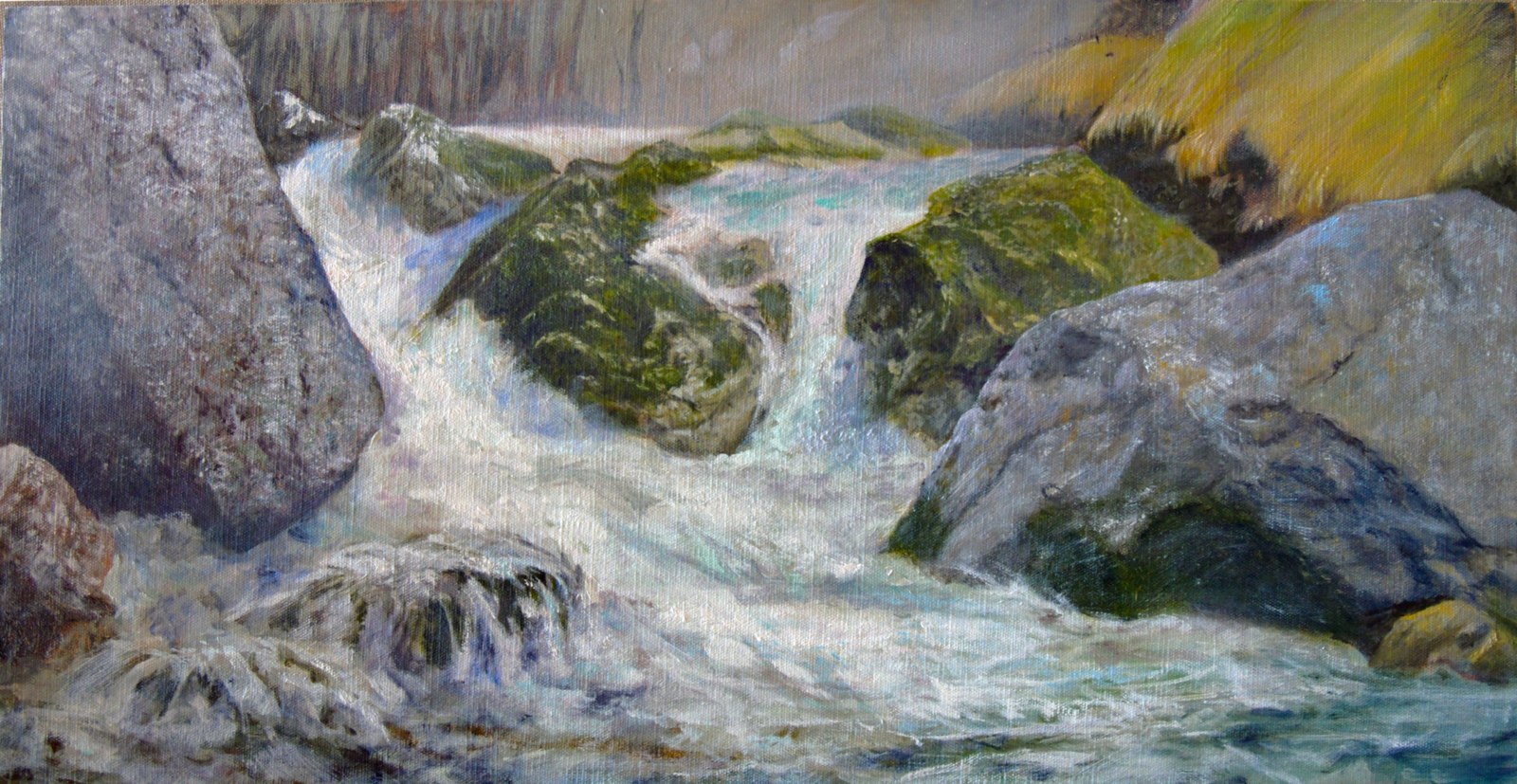 |
| Thaw, the oil painting these value studies led to. |
| Atelier Joseph Sherriff |
From the letter of 29 October 2026
Lire en français