| Joseph E. Sherriff · Studio letter |
| 29 October 2026 |
| Hello, | | From Saint-Pierre-de-Chartreuse: this week, a featured artist, Ted Kautzky, who thought in shapes; my first nude studies; the reworked anatomy workshop programme; the Notan tool in Composition; the promised follow-up on value studies; and part 4 of “Why paint?”. | 1) Featured artists — Ted Kautzky: Thinking in Shapes| Pencil pictures built from a few shapes of light and dark | | As a boy, leafing through a book that belonged to my father, I was struck by Ted Kautzky's trees: dark silhouettes against light, light branches against dark, the two weighed against each other like a balance. My father had a word for it: counterpoise. It is still what I look for when I plan a painting. | | Theodore "Ted" Kautzky was born in Budapest in 1896 and trained as an architect. In 1923 he left for New York, where he worked as an architectural designer and renderer. His name spread through drawing. In 1935 the magazine Pencil Points ran a pencil-sketch competition, and Kautzky took first prize. With the magazine's editor, Reid, he went on to publish Pencil Broadsides (1940), "a manual of broad stroke technique", and Pencil Pictures (1947), later followed by books on watercolour, including Ways with Watercolor (1949). He taught at Pratt Institute, New York University and the University of Pennsylvania, and died in 1953, aged 56. | | He is remembered above all for his pencil work, his "pencil paintings", as he called them. The name fits. Using the broad side of the lead, he laid down whole planes in one stroke: a roof as a single dark band, a wall left as bare paper, a mass of foliage as one mid-tone. There are only a few values, and each has a job. The light side of a house reads because the shadow beside it is decisive. Nothing is shaded "to be safe". | 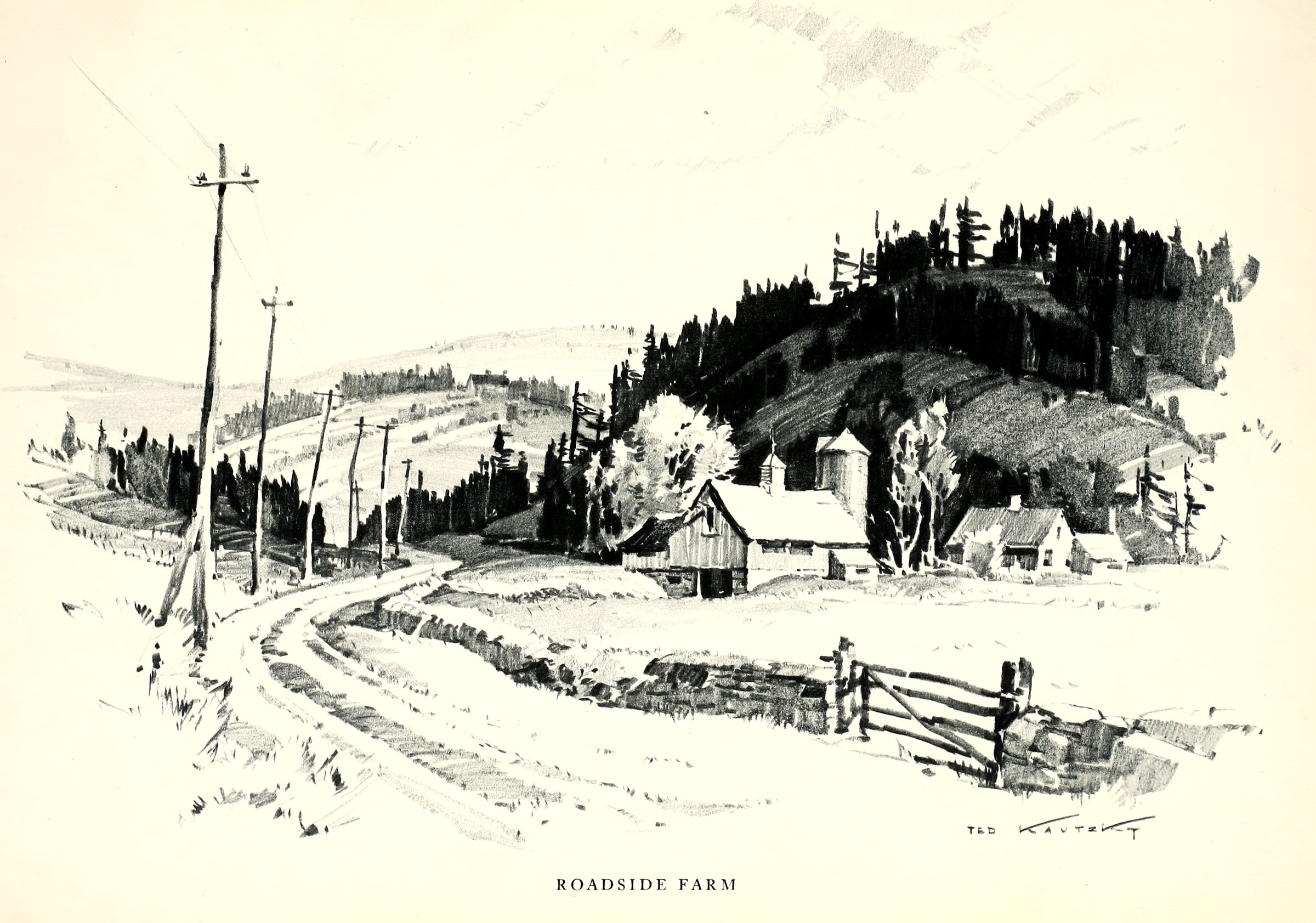 | | Ted Kautzky, Roadside Farm, 1947. Broad-stroke pencil. From Pencil Pictures: A Guide to Their Pleasing Arrangement (Reinhold, 1947); scan via Internet Archive, public domain in the EU. | | In Roadside Farm the whole picture is built from a handful of shapes: the dark wooded hill, the pale roofs of the farm set against it, and the white road curving in from the foreground. The darks are grouped in one mass behind the buildings, the sky and road are left almost empty, and that contrast pulls the eye straight to the farm. | 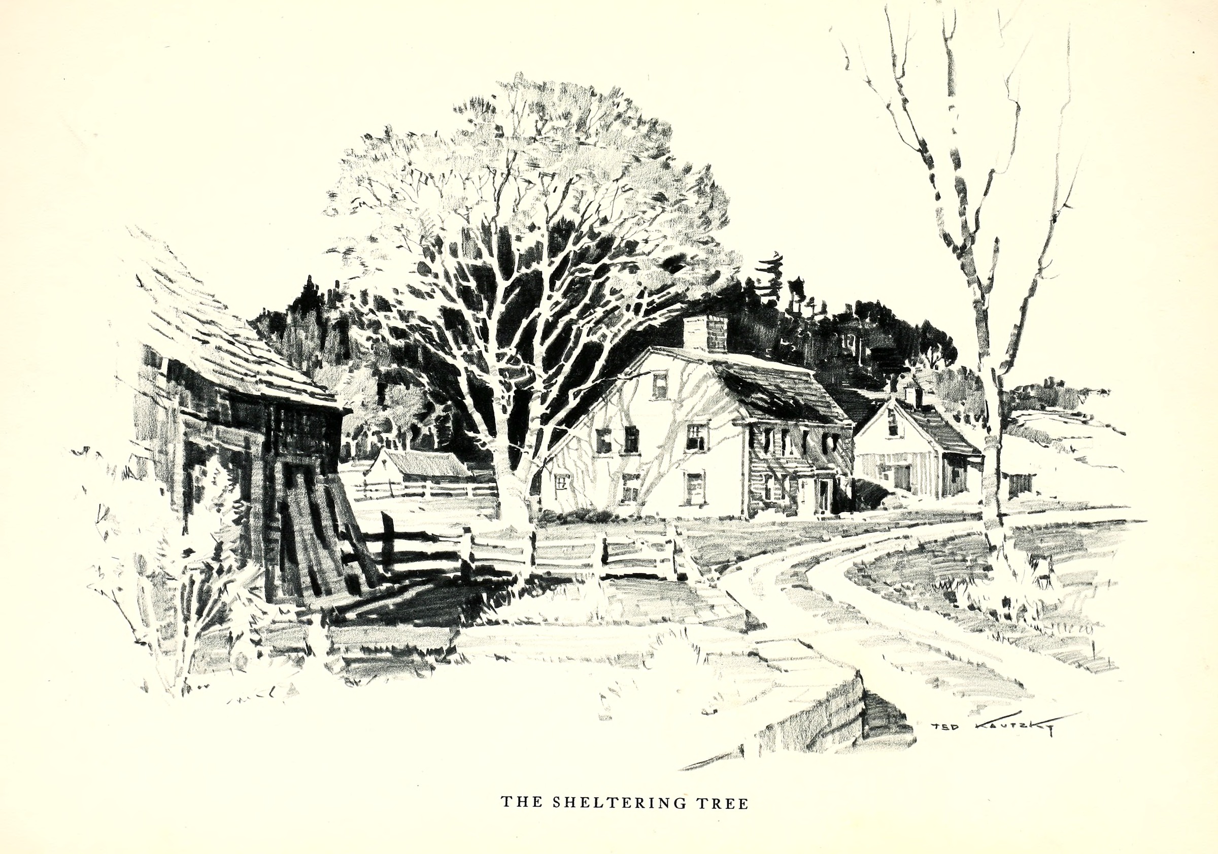 | | Ted Kautzky, The Sheltering Tree, 1947. Broad-stroke pencil. From Pencil Pictures: A Guide to Their Pleasing Arrangement (Reinhold, 1947); scan via Internet Archive, public domain in the EU. | | The Sheltering Tree shows the counterpoise I remember. The big tree in the middle is drawn almost entirely as light: pale trunk and branches cut out against a band of dark woods behind the house. On the right, a thin bare tree does the opposite, its darker trunk standing against an empty sky. The same subject, a tree, is light on dark in one place and dark on light in the other, and the house sits between them. | | Why does this matter for us at the easel? Because the hardest step in landscape painting is not the brushwork but the decision about what to leave out. Kautzky's drawings show, page after page, how a scene becomes a few shapes of light and dark arranged on a rectangle. Beside a Chartreuse stream, with rocks, foam, branches and reflections all asking for attention, that is the question to ask first: what are my three or four big shapes, where are my darks, and what will stand light against them? | | Atelier Joseph Sherriff |
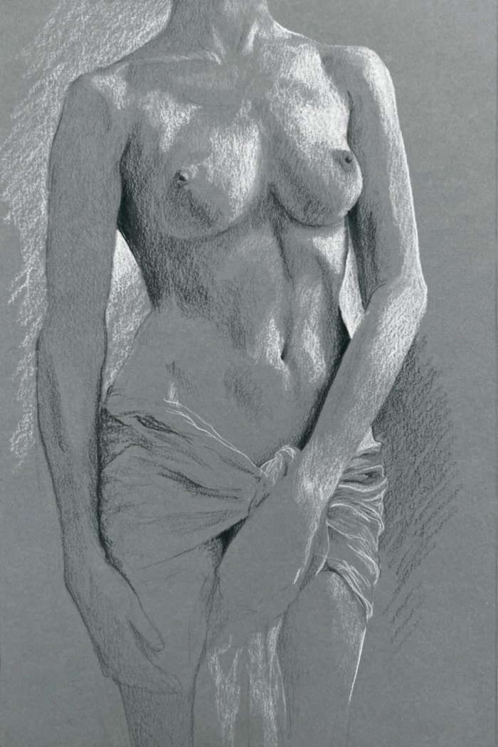
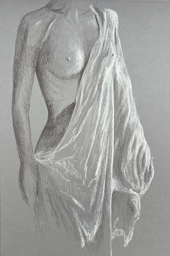
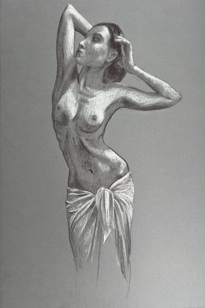
| | 2) New paintings — Nudes | | For a while now I have been working from the live model. Here are the first studies in this new series, in pastel on paper, with draped poses. They are studies in the true sense, made to understand mass, weight and light on the body, and they feed straight into the anatomy workshop below. | | | Joseph E. Sherriff, Draped Nude, Monochrome; Draped Torso, Study; Nude with Raised Arms, Study. Pastel on paper, 39 × 26 cm. | - Draped Nude, Monochrome · pastel on paper · 39 × 26 cm · €120.00
- Draped Nude, Study · pastel on paper · 39 × 26 cm · €120.00
- Draped Torso, Study · pastel on paper · 39 × 26 cm · €120.00
- Nude with Raised Arms, Study · pastel on paper · 39 × 26 cm · €120.00
| | See the whole series here: joseph-sherriff.com/en/collections/nus. Paintings in the series are in preparation. | | 3) Workshop | | Next workshop: “Les fondamentaux de l’anatomie en dessin” (Anatomy fundamentals in drawing). I have reworked the programme so that it leads to one clear goal: learning to draw a model in contrapposto convincingly. | Sundays 15 and 22 November 2026 · 10:00–17:00 (lunch 13:00–14:00)
Maison Prataz, Les Échelles
€135 for the two days + annual Maison Prataz membership (€15 individual / €20 family). The price is a little higher than usual because it includes the live-model session. Materials included. Adults only, 4 to 6 participants. | | Day 1: the three skeletal masses in an eight-head grid, the bony landmarks, the bony processes and muscle attachments, then the muscle groups (torso, back and neck, limbs). Each participant builds their own écorché, layer by layer, on tracing paper. | | Day 2: the three masses in contrapposto, all the landmarks together, constructing a contrapposto figure from imagination, and in the afternoon a live-model session (« modèle vivant »). | | There are three levels; each participant chooses their own. This workshop can be taken independently of “L’anatomie en mouvement” (Anatomy in motion, 23–24 January 2027). | | Bookings directly with me: joseph.e.sherriff@gmail.com · +33 6 45 76 97 36. (Taught in French.) | | 4) ClearIdeas — Seeing in light and dark: Notan for value studies | | A two-minute read | | Before colour, before brushwork, a painting holds together, or falls apart, on its values: how light or dark each area is forms the backbone of a composition. Squinting at the motif helps, but it is hard to see your own painting clearly. That is what the Notan tool in the Composition app is for. | | What Notan is | | Notan is a Japanese word for the harmony of light and dark. A Notan study reduces a picture to a few flat values, so that the big shapes show up without colour, texture or detail getting in the way. If the design still reads in two or three values, it will read in full colour. | | How the tool works | | Upload a photo of your painting, or of the scene you are about to paint, at clearideas.art/composition. Open Advanced Features and choose Notan. You can choose between three levels of simplification: | - 2 values: pure black and white. This is the hardest test: do the main masses separate clearly, and does the eye go where you want it?
- 3 values: dark, middle and light. This is the classic value study for most landscapes, and the one I come back to most.
- 5 values: black, dark, middle, light and white. It is closer to the painting, and useful for checking the half-tones and the transitions between masses.
| | Auto lets the app choose where the breaks fall. The Threshold and Light threshold sliders let you move them yourself, so you can see exactly where a rock tips from shadow into light. | | What to look for | | In the example below, the 2-value version shows the whole structure at once: a dark diagonal band of wet rock against the light of the water. The 3-value version separates the middle tones of the bank from the shadows. The 5-value version brings back the modelling of the stones without losing the big pattern. | | A strong design usually shows a few large, simple masses, with the strongest contrast gathered at the centre of interest. If your Notan looks like scattered confetti, with small darks and lights everywhere and no dominant shape, the painting will look busy however good the colour is. If the brightest light and the deepest dark meet somewhere other than where you want the eye to go, you have found a rival focal point. | | Using it in practice | | Use it before you paint, on your reference photo, to decide whether the motif is worth painting and how to simplify it. Use it during a painting, from a phone photo, when something feels wrong but you can't say what. And use it afterwards, to understand why some paintings work better than others. | | Give it a try at clearideas.art/composition. | | All these tools are intended for iterative use, enabling us to learn from our mistakes and avoid repeating them. We can also better appreciate the range of choices available, without becoming overwhelmed. In this way, step by little step, we can use what we have gained for our future work without relying on outside feedback. | 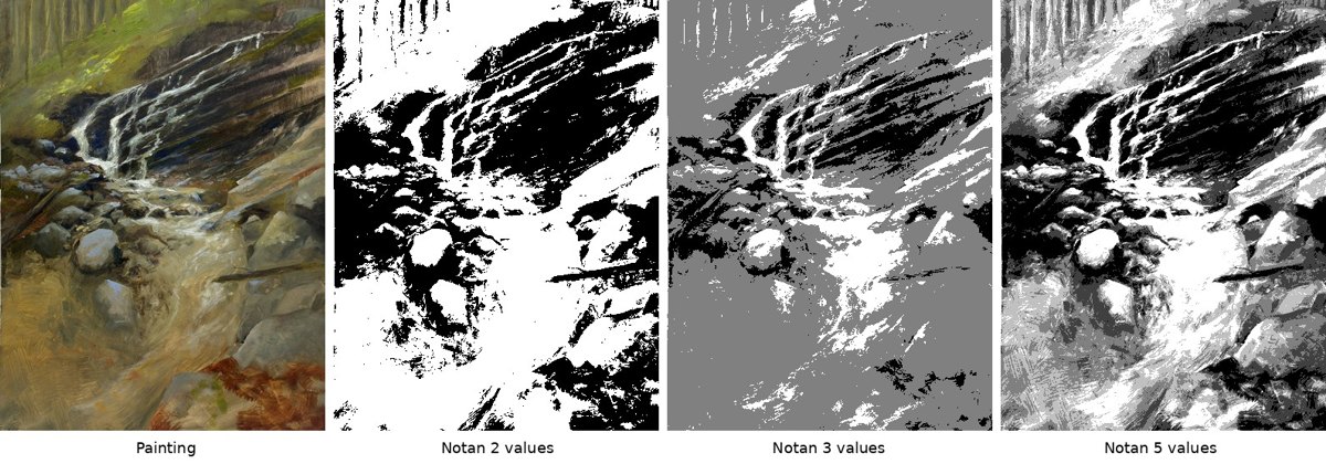 | | Composition, Notan: the painting, then 2, 3 and 5 values. | | Atelier Joseph Sherriff | 5) Technical thoughts — Light and Dark First: The Value Study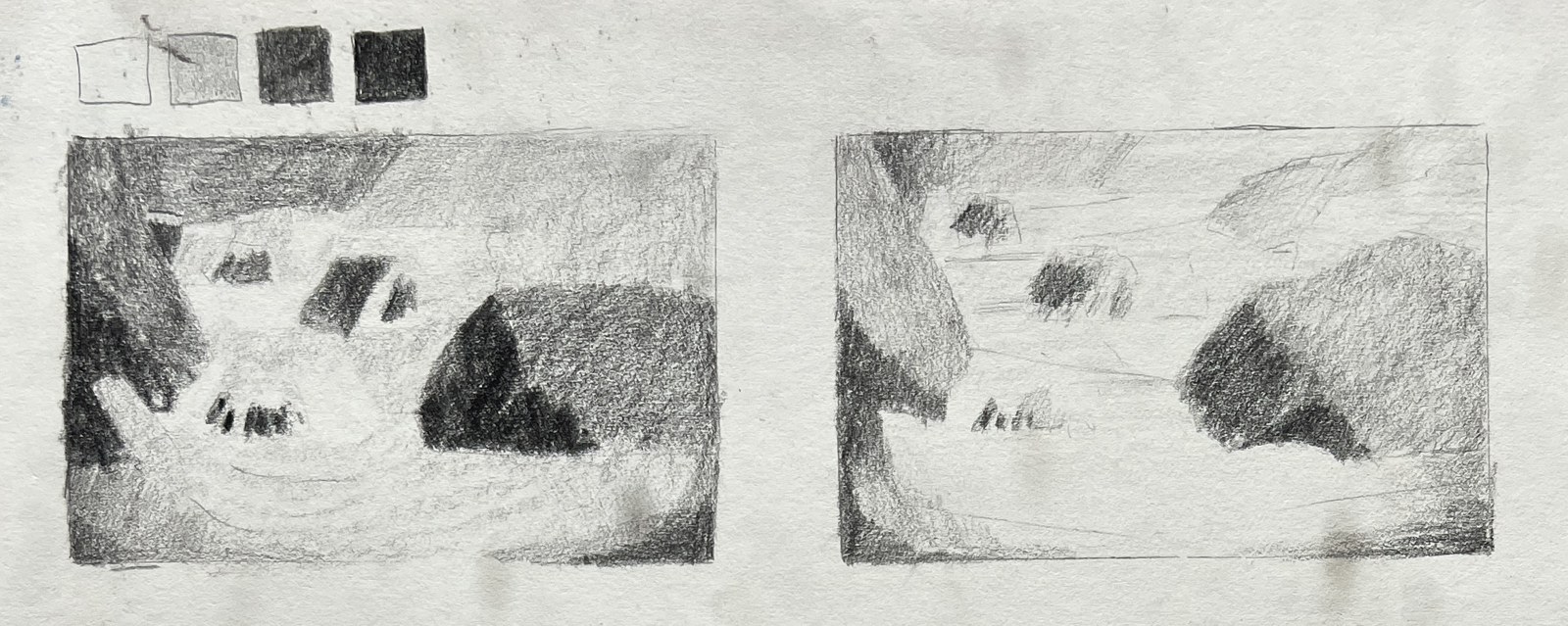 | | Two pencil value studies, with a four-value scale. | | Last week's article ended with a promise: once the edges of a painting are chosen, the next decision is where the lights and darks will go. That decision is the value study, and it does more to hold a composition together than any other step. | | Value is simply how light or dark something is, regardless of its colour. A red roof and a green field can be exactly the same value, and in a black-and-white photograph they would merge. There is an old saying in painting classes: value does the work, colour gets the credit. A picture with harmonious colour but muddled values falls apart from across the room. A picture with clear values reads even in grey. | | Squint. Outdoors, the eye is flooded with detail: every stone in the riverbed, every leaf, every glint on the water. Half-closing the eyes removes most of it. Small differences disappear and the scene resolves into a few large masses of light, middle and dark. Those masses are the real structure of the motif. | | Three or four values. Nature offers endless gradations; a painting needs very few. A useful working scale is: light, light-middle, dark-middle, dark. Every area of the scene is assigned to one of them. The rocks in shadow, the dark band of forest and the underside of a bridge may all go into the darkest group, even though they are different colours. This is a simplification, and it is meant to be. | | A small sketch before painting. A value sketch takes five to ten minutes, in pencil or a marker, a few centimetres across. It is not a drawing to keep. Its job is to test the arrangement before paint is committed: if the sketch does not work, the painting will not either, and it is much quicker to fix at this size. | | Shapes and their sizes. Each value group forms shapes, and the sizes of those shapes matter as much as their values. A strong composition usually has one big shape, a few medium shapes and some small ones. Equal masses (half the picture light, half dark, or three trees of the same size) tend to feel static. Unequal masses create movement and a clear hierarchy. | | Building toward a centre of interest. Shapes of different sizes and values work together to lead the eye. The greatest contrast, the lightest light against the darkest dark, belongs at the focal point. Elsewhere, values stay closer together and quieter. Darks can be linked into one connected shape, and lights likewise, so that the eye travels along them instead of jumping between scattered spots. On a mountain stream, that might mean one sunlit stretch of water set against the darkest rocks, with the banks and the forest held in the middle values around it. | | Ted Kautzky's pencil drawings, shown in this week's featured artist, are a clear demonstration. They are essentially value studies: a few flat tones laid in broad strokes, with bare paper kept for the lights. His watercolours apply the same thinking in colour: each area a clear shape, painted once, with the darks grouped and the open spaces left quiet. | | The value sketch can save hours of correcting a painting that never quite holds together. It replaces the question "what colour is this?" with more useful ones: "how light or dark is it, and how big?" | 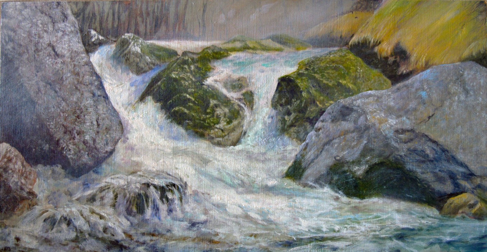 | | Thaw, the oil painting these value studies led to. | | Atelier Joseph Sherriff |
| 6) Why paint? (part 4) — Fluidity| There is a notion that's become increasingly important to me and increasingly well defined: the notion of fluidity. I've also come to learn that there's a whole psychological discipline devoted to this idea under the name of flow, and I will talk more about that later. | | In my own experience, I have felt a growing need to dedicate a set amount of time to the highest performance of my chosen activity, which is painting. That might seem obvious. When a musician or an athlete steps onto the stage or into the arena, they know the performance is bounded by a beginning and an end. | | As a painter, you're subject to various forms of resistance, and it's very easy to drift away: go and eat some chocolate, take a toilet break, stretch your legs, chat with whoever comes past, and probably many other ways of not being 100% committed and engaged. | | There are also many material considerations that I have refined for myself [for example, brushes, paint consistency, and colour], and I believe much of this advice can be useful to others too. It all aims at one period with a clear beginning and a clear end, devoted to the highest-intensity activity possible, and therefore at removing as many obstacles as possible. It is also important to have a clear goal, to know exactly what you want to do and how you want to achieve it, and for that goal to be just challenging enough to keep you fully engaged. | | But why should that matter? It's hard to say, other than that the intensity of the experience is itself the reward you are looking for. It's the intensity and the fluidity, that feeling of being alive. | | I remember when I first started painting again, after a very long break for family reasons, financial reasons, and probably resistance reasons. I finally took some time and went into the Gorges du Guiers Mort. I came out at the end with a rather unimpressive painting, but feeling alive. I said to myself, "From now on, my guide in my artistic decisions must be: do whatever makes me feel the most alive." | | For me, that happens most easily when I'm outside: outside of society, outside of my studio, outside of my own head, when I'm in nature. | | The feeling of being alive comes from fluidity: when your actions seem to flow automatically one from the last, when the separation between your thinking and your doing disappears, and when time seems to disappear too, or to pass very quickly. When you experience that, you understand. | | This is the central reason I paint. All the side activities that go around it (and there are a lot, and I'm afraid they're not as fluid as I wish they were) serve to create the possibility of these moments of intense, fluid aliveness. | | Atelier Joseph Sherriff |
| | 7) Shop | 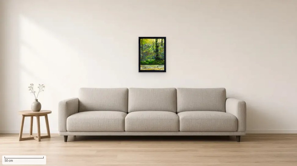 | | Vibrations vertes — Guiers Mort, oil on wood, 45 × 35 cm, seen “in your room” (the site’s “See it in your room” tool, sample living room). | | A painting is only really judged on the wall. On every shop page, the “See it in your room” button shows the work to scale in a living room, a dining room or a chalet entrance, and you can even try a photo of your own wall. Shown here: Vibrations vertes — Guiers Mort, oil on wood, 45 × 35 cm, €480.00. | | Original oils painted in the Chartreuse are available in the shop: joseph-sherriff.com/en. |
| Thanks for reading. |
Joseph E. Sherriff
Atelier Joseph Sherriff · Saint-Pierre-de-Chartreuse
joseph-sherriff.com
joseph.e.sherriff@gmail.com · +33 6 45 76 97 36 |
|
|