| Joseph E. Sherriff · Studio letter |
| 13 November 2026 · about 12 min read |
| Hello, |
| From Saint-Pierre-de-Chartreuse: this week, John Singer Sargent and a firm drawing under an open touch; two new nude studies from the studio; the Drawing Skills app; warm sunlight and cool skylight; and setting the rules of the game, in “Why paint?”. |
1) Featured artists — John Singer Sargent: a firm drawing under an open touch · 3 min read |
| John Singer Sargent (1856–1925) was an American painter, born in Florence to expatriate parents. In 1874 he entered the Paris atelier of the portraitist Carolus-Duran. Portraits made his reputation on both sides of the Atlantic. Around 1907–1908 he said he was "shutting up shop in the portrait line", and he turned more of his time to landscapes, informal figure studies and murals. He died in London. |
| What interests me in Sargent's work is the precision that underlies a seemingly loose gesture. We can see it plainly in his figure work and, most relevant for me, in his treatment of water. Precision and looseness recur together throughout his work, and together they give a sense of vitality and freshness that has lasted more than a century. |
| This looseness can only work convincingly when the structure underneath is exact. It relies on precise observation, disciplined drawing, and capturing something essential in the expression: the tilt of a figure's head, the shape of a shadow around a rock, or the underlying value structure of a composition. |
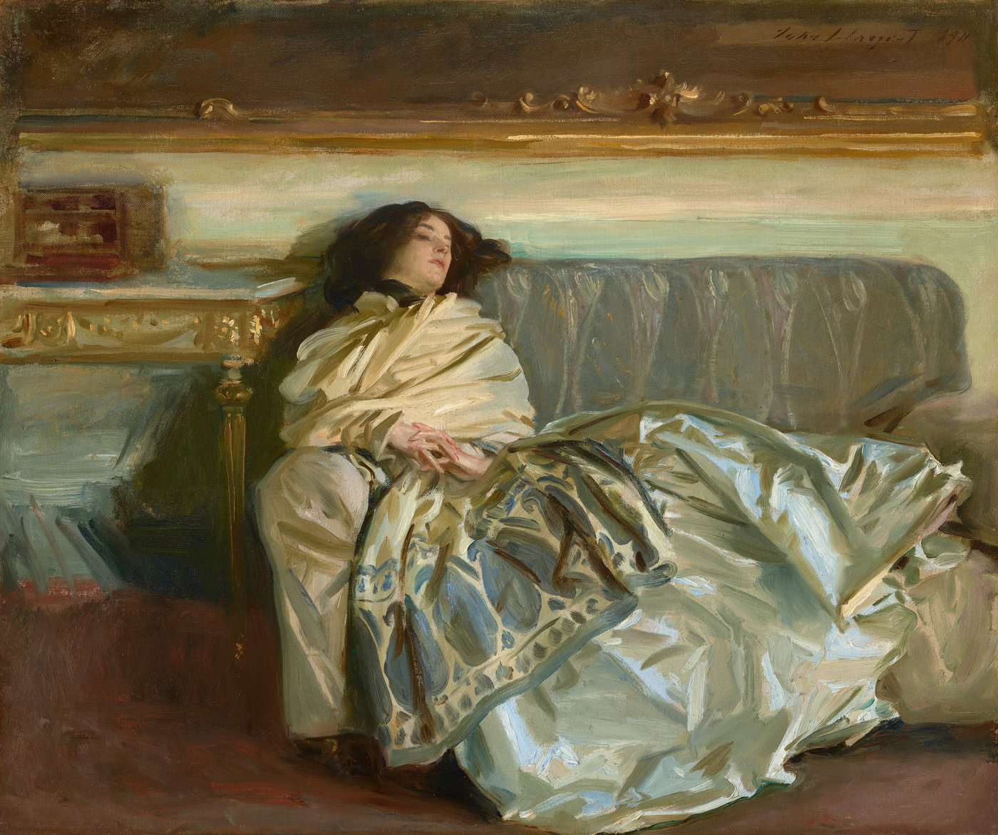 |
| John Singer Sargent, Nonchaloir (Repose), 1911. Oil on canvas, 63.8 × 76.2 cm. National Gallery of Art, Washington. Gift of Curt H. Reisinger (public domain). |
| The woman is Sargent's niece, Rose-Marie Ormond, though this is not a formal portrait. He first called the picture Nonchaloir. If you zoom in, you will see very loose but extremely precisely placed gestures that suggest the folds of the cloth with great plasticity; you can feel its silkiness. The features suggest the volume of the face and the skull, and we must imagine with reasonable likeness. The gilded frame is suggested with a few accurate strokes that capture the movement and the glow of the gilding, with great economy of means. The accuracy of the face and hands matters too, because that is where our attention goes first. And, of course, the whole scene captures the mood of the resting figure. |
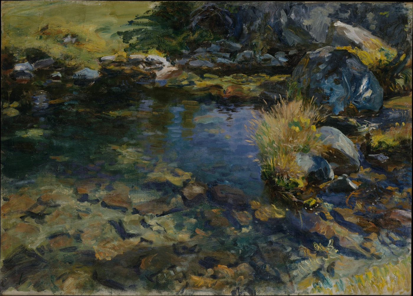 |
| John Singer Sargent, Alpine Pool, 1907. Oil on canvas, 69.9 × 96.5 cm. The Metropolitan Museum of Art, New York. Gift of Mrs. Francis Ormond, 1950 (public domain). |
| He brought the same approach outdoors. In 1907, staying at Purtud, north of Courmayeur in the Italian Alps, he painted a series in oil and watercolour of the hamlet's small mountain brook. Alpine Pool is a close view, looking down. |
| As somebody who spends a lot of time painting water, this painting has caught my attention on a number of occasions. When you paint water, there are several layers to consider. You start at the bottom: the sand and the rocks. You don't see them directly; they are distorted by the refraction of the water. |
| The movement of the water adds another layer of distortion. Then there is the surface itself, which shows up around rocks that stick out of the water, as at the top right. Notice the freshness of that rock and of the reeds growing there, compared with the more muted colours under the water. |
| Reflections bounce off the surface and can also suggest movement, and the colours reflected on the surface mix with the objects beneath. The interplay of colours can become very complex. |
| What we see here is a masterful rendering, again with great economy of means, of a simple rock pool: a contrast between what is below the water and what is above, and between what is in light and what is in shade. |
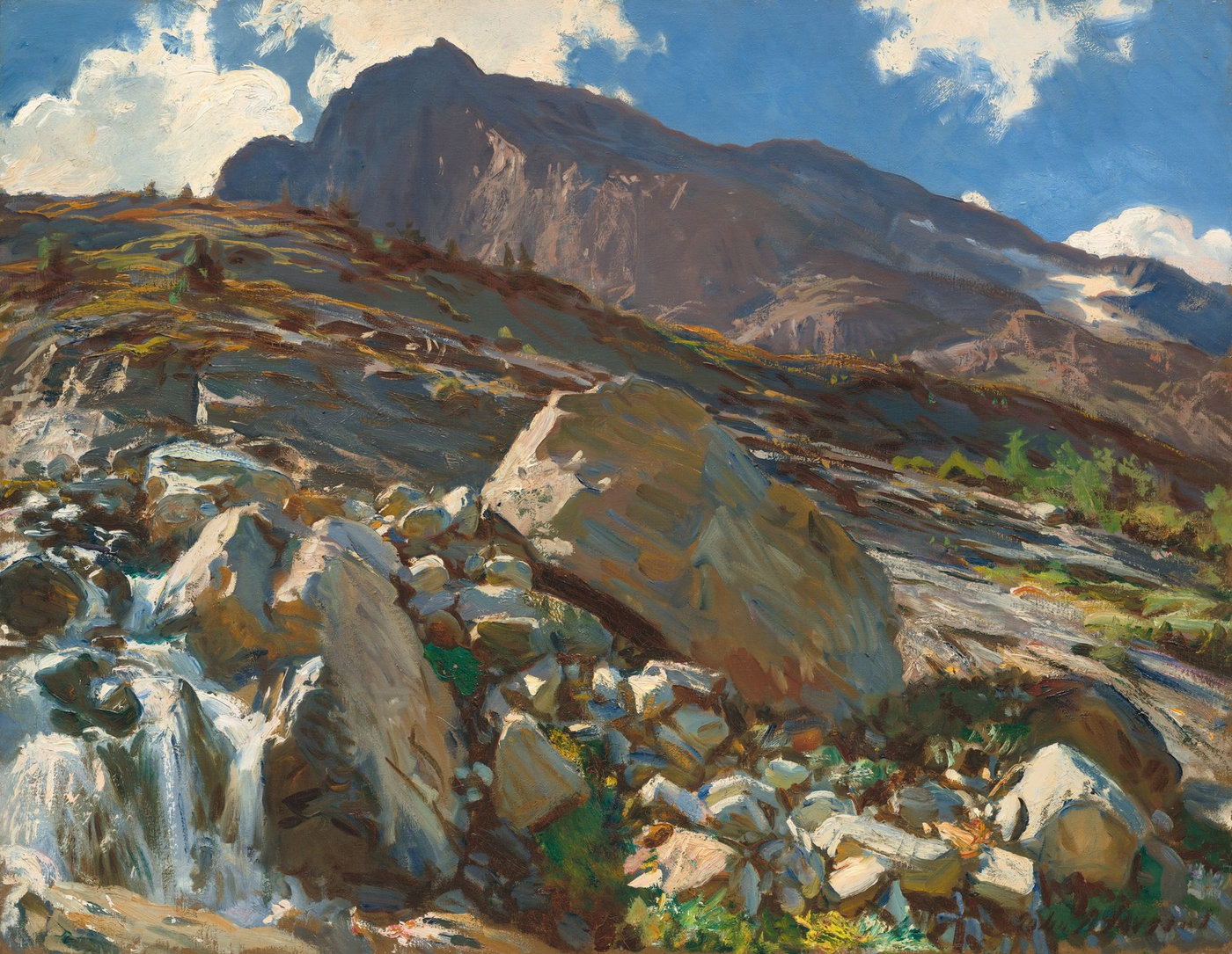 |
| John Singer Sargent, Simplon Pass, 1911. Oil on canvas, 71.8 × 92.6 cm. National Gallery of Art, Washington. Corcoran Collection (Bequest of James Parmelee, 1941) (public domain). |
| Simplon Pass, painted in 1911, opens the view. Sargent had known this Alpine pass, on the Swiss–Italian border, since at least 1904, and he returned for long stays in 1909, 1910 and 1911. |
| One of the first things I notice in this painting is that it is more about shapes. Another painter, myself included, might have made the water the main subject; here it serves only as a bracket in the lower-left corner, a textural complement to the small rocks in the middle foreground. The larger shapes dominate: the central boulder, the rocky slope behind it, and the distant mountain surrounded by sky and clouds. The colour is very interesting too, above all the contrast of warm and cool: warm light, and cool blue shadows lit by the sky. Colours are more muted in the distance and strong and saturated in the foreground, with some surprising colours in the shadows. We still find similar treatment today in the work of many landscape painters, such as Kimball Geisler, Mark Boedges, Kathleen Hudson and, I'm sure, many others. |
| Atelier Joseph Sherriff |
|
| 2) Seen in the studio — Two figure studies · 1 min read |
| This is the part where you get to look behind the scenes. I'll show you some studies I'm working on that are not intended for publication other than in this newsletter. |
| November is a quiet month for me. I have no exhibitions planned, the next one being in December in Maison Prataz, Les Échelles. I feel that I have come to the end of a cycle with the water landscapes, at least for the moment. I have a nice collection in my studio, and I'm wanting to work in a new direction. Painting human beings, as portraits and figures has been on my mind for a very long time, and now I feel it's the moment to get active. |
| Also, a quiet space like this allows for reflection on the direction I want to pursue, and as I've already indicated, I have some ideas that are crystallizing. I know I want to work around the notion of fluidity, which means having clearly defined goals and simplifying your tools to the essential elements. I know my guiding principle is painting in the way that makes me feel most alive, which means from the model and outdoors as much as possible. That will continue. |
| Also, now I want to continue to define this polarity or complementarity of precision and looseness, or clarity and dreaminess, if you want other terms. The works I present here are simple studies. They are not from a model; unfortunately, sometimes practical considerations outweigh our ideals. These are from found photographs, but they serve as exercises for exploring the above-mentioned principles. I hope to soon be working directly from live models. |
| Anyway, this is what you can see in my studio today. |
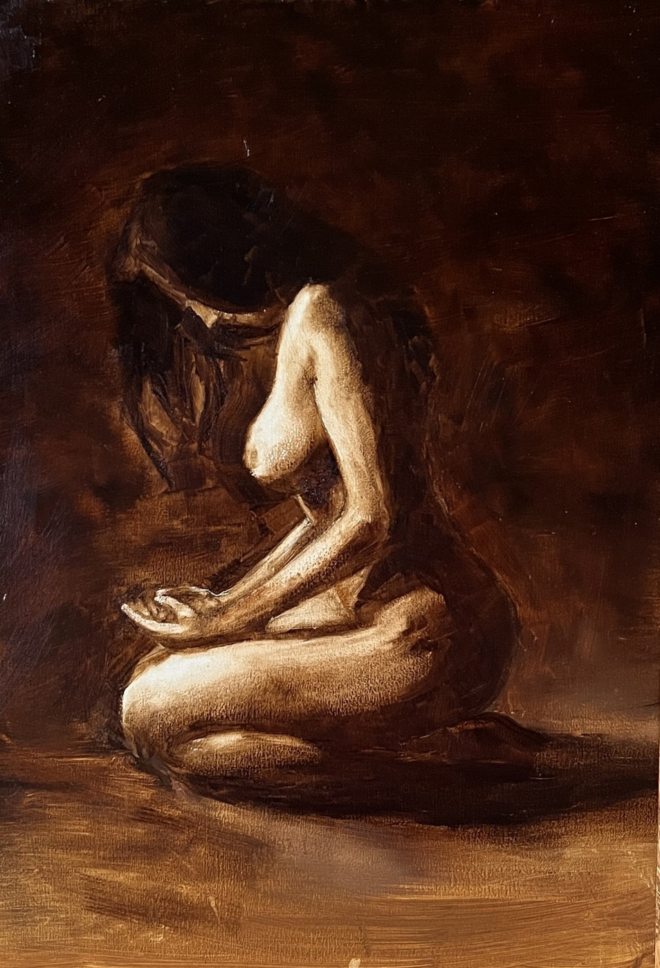 |
| Joseph E. Sherriff, Untitled study, 13 November 2026, oil on wood. |
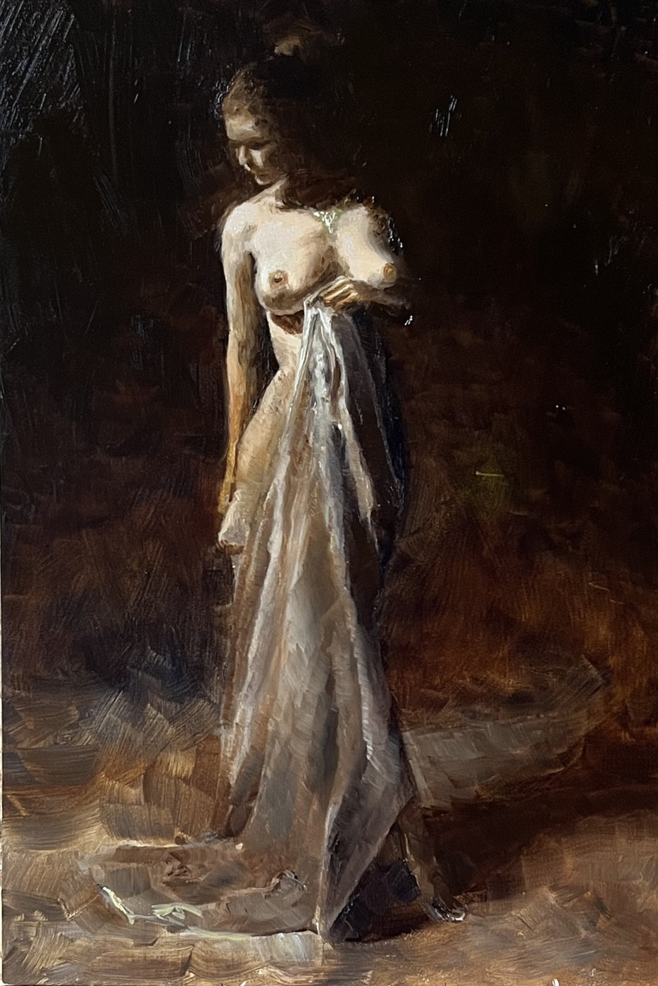 |
| Joseph E. Sherriff, Untitled study, 13 November 2026, oil on wood. |
|
| 3) Apps: Drawing Skills — seeing where the drawing left the model · 2 min read |
| You may have had this experience: you notice something is not quite right with your drawing, but you can't put your finger on it. If you had a really competent teacher right now with you, maybe he could help you, but most of the time, you don't. To advance, to progress, we need feedback. I developed the Drawing Skills app to help us see our mistakes so that we don't need to repeat them. |
| Upload a photograph of the subject as the reference, and another of your drawing. The app reduces the reference automatically to its contours. On the Reference side, a slider moves between the photograph and those contours (Both, Ghost, Photo), so you can study the lines alone. |
| There are two ways to work with your own drawing. |
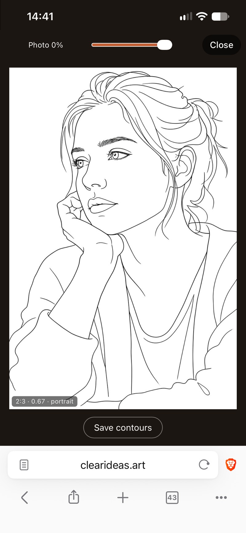 The reference reduced to its contours: the slider fades the photograph out, so you can study the lines alone. | 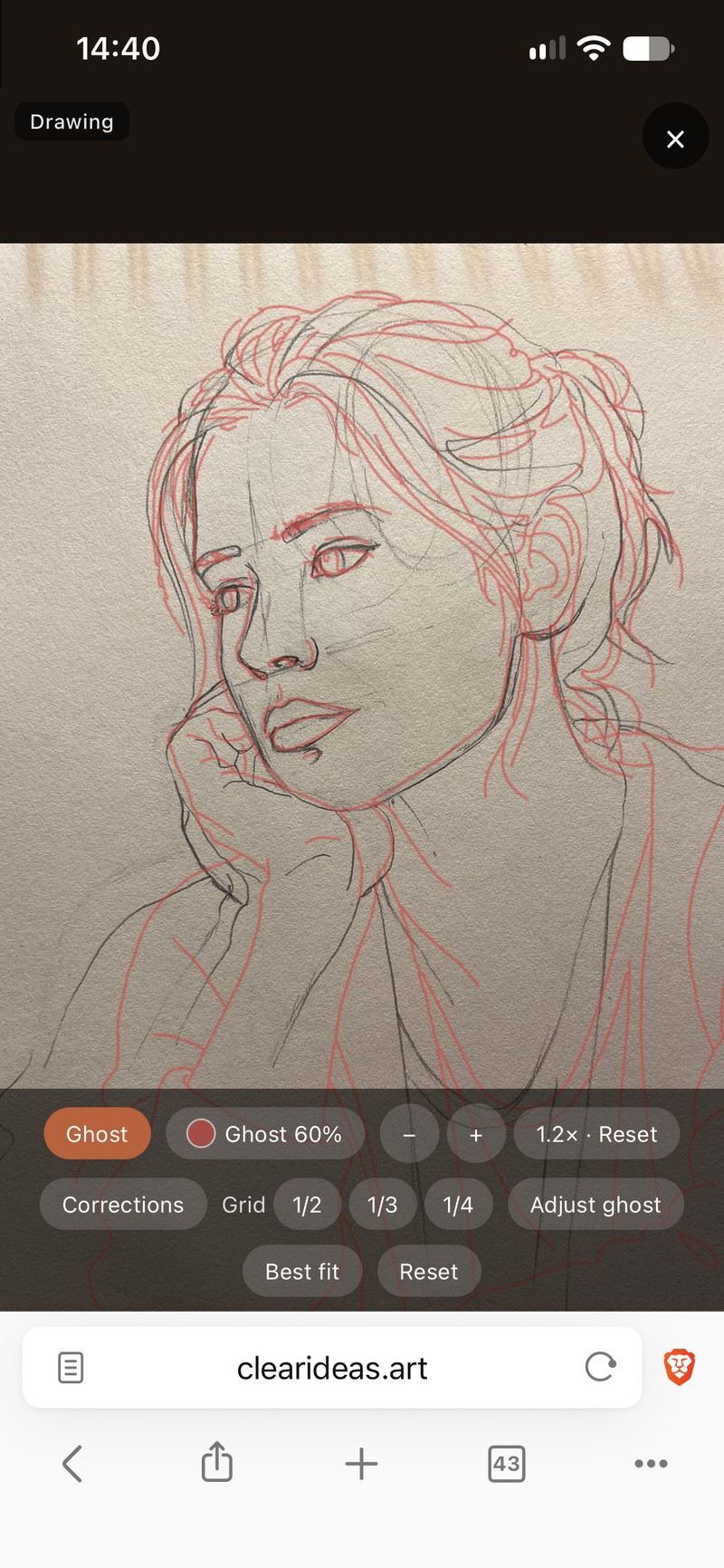 Method 1: the model's contour laid over the drawing as a red ghost, here at 60%. | 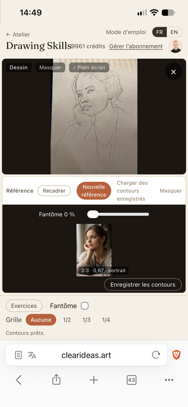 The drawing and the reference on one screen (French interface). | 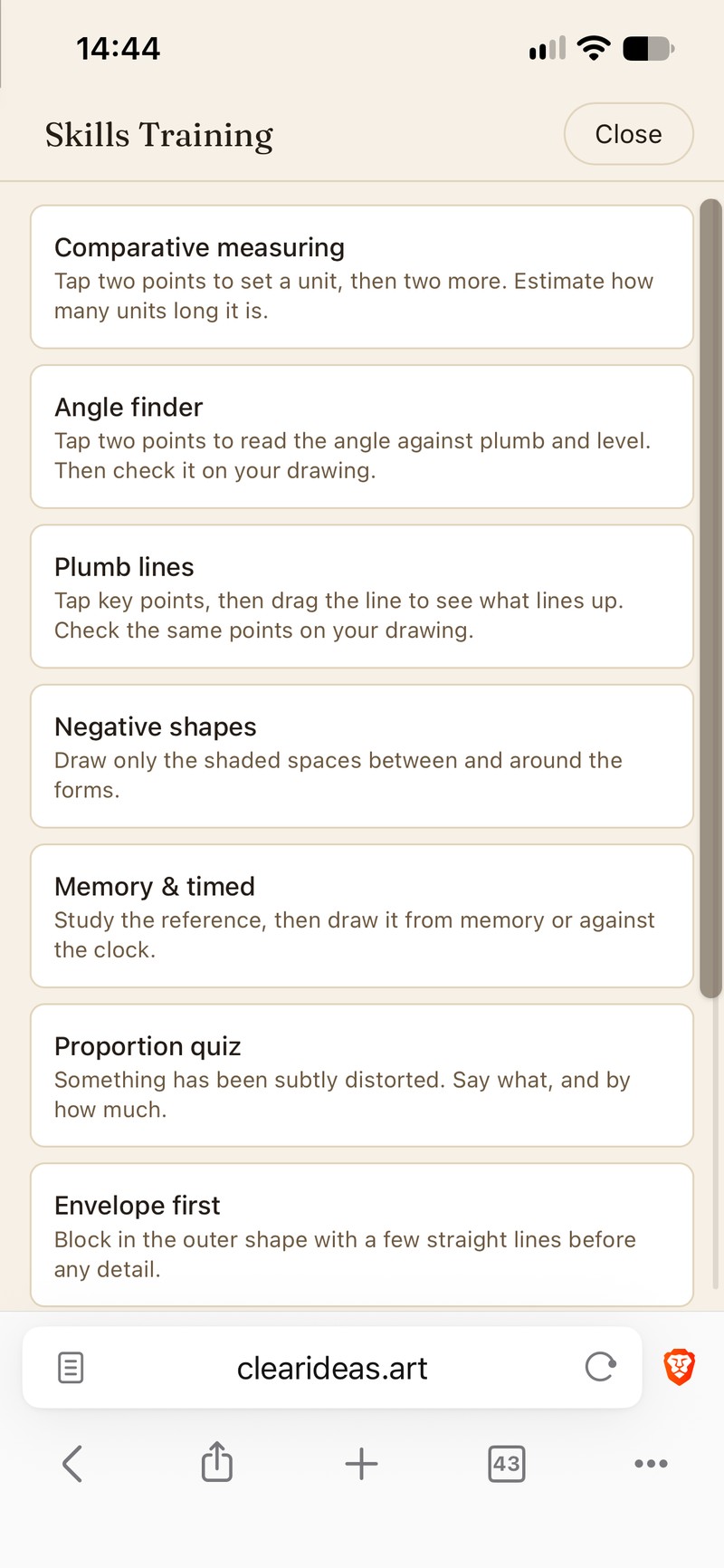 The Skills Training list: comparative measuring, angle finder, plumb lines, negative shapes and more. |
|
| Method 1 shows errors in your drawing. Draw as you normally would, then point the camera at the paper (this works best if your phone doesn't move) or upload a photo of the sheet. The model's contour is laid over your marks as a ghost, in a colour you choose. |
| A slider under the drawing runs from Ghost to Drawing, with Both in the middle, so you can see the two together or each one alone. Once the photo is taken, the ghost is lined up automatically. If it sits wrong, tap Best fit to line it up with your drawing. Then use Adjust ghost to drag, pinch or twist it; Reset returns to the automatic placement. I would recommend drawing contours only at first, to get the cleanest training. Once the contours are sound, then you can proceed to shading. More about that later! |
| Method 2 guides your hand. Point the camera at your paper and trace the ghost with your pencil. Keep the camera still and square to the paper; from an angle the ghost is distorted. Before you take a photo, the ghost stays where you put it, so you can place it first with Adjust ghost. |
| Try it on a drawing you have just finished, to see where you can improve accuracy and fluidify your work. This app aims to liberate your potential by giving you the necessary feedback when you need it. There is a seven-day trial, no card asked for, shared with Composition. |
| Try it: www.clearideas.art/drawingskills |
| Atelier Joseph Sherriff |
|
4) Technical thoughts — Warm sunlight, cool skylight · 2 min read |
| When painting outside in sunlight, we have to consider two sources of light: the warm light coming from the sun, and the cool light coming from the blue sky. That blue light is very pale, and it is easy to overlook if you're not looking for it. |
| The bright sunlight is obviously dominant, and wherever it falls directly, that is the light you will see on the surfaces it strikes. In the shadow areas, where the sunlight doesn't reach directly, the cool blue light of the sky can still be seen. Objects in those shadows are lit by that same cool blue light. Where they are not lit by the sky either, there will be a warm, dark brown shadow. |
| So you have a gradient: warm bright sunlight, cool blue skylight, and then warm dark shadows. Warm, cool, warm again. Those dark shadows are not simply dark brown; it depends on what is in them. They can be dark green, for example, or some nuance of dark brown. They will be dark, but they are not black. They're not blue, and they're not cold. |
| It can be very interesting to spend time just looking into shadows and noticing all the nuances there. That can also afford a richness to our paintings: to vary the shadows in these nuances. Have a look at the Sargent painting above with the rocks, Alpine Pool. See if you can find the blue flecks in the shadows. Now you know why they are there. |
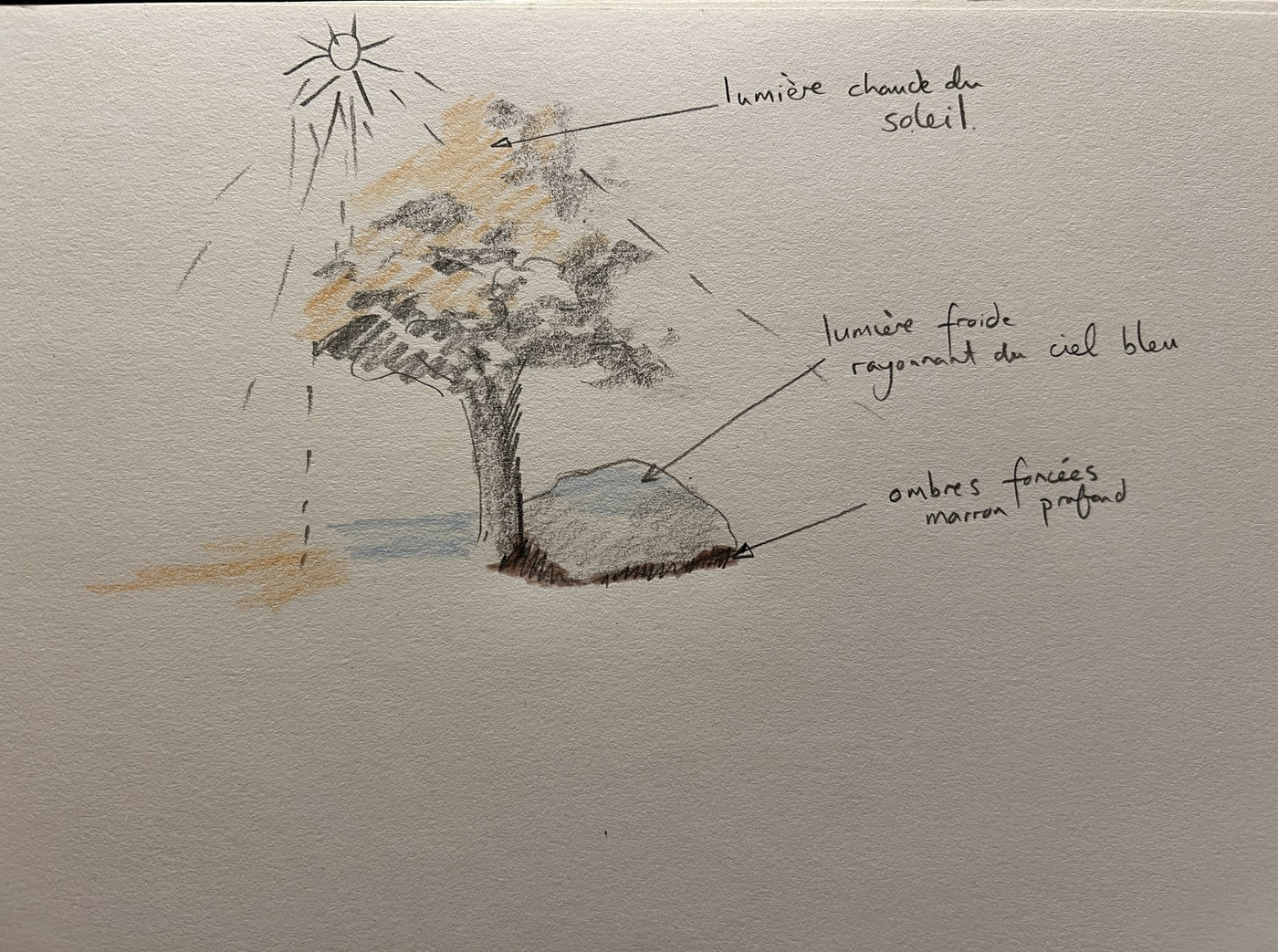 |
| Warm light from the sun, cool light radiating from the blue sky, and darkened, deep brown shadows. Drawing by Joseph E. Sherriff (labels in French). |
| Before I start painting, I mix a group of six colours, from warm sunlight through cool skylight to warm dark shadow: |
1. Sunlight: titanium white with a touch of Indian yellow and transparent yellow oxide, which comes very close to the actual colour of sunlight. As this colour deepens and becomes darker, it becomes warmer, so the next two steps follow it down.
2. Deeper sunlight: less white and more of the two yellows.
3. Filtered sunlight: the same, made redder with some transparent red oxide. This is very useful for spots of sunlight that have passed through a forest, for example, before landing on a tree trunk. Filtered sunlight becomes warmer, redder and darker.
4. Pale skylight: white and cobalt blue, for the cool light of the sky-lit shadows.
5. Stronger skylight: the same, with more cobalt blue.
6. Dark shadow: cobalt blue and transparent red oxide, taking care always to stay on the warm side, so it's always a little brown. It never goes quite black, as a mixture of these two complementary colours can. |
| I use these colours almost every time I paint outside in sunlight, so I pre-mix them into tubes. When I get to where I want to paint, I just squeeze these six colours onto my palette. I can mix them with any of the other colours I use that day to create the impression of warm sunlight, cool skylight and dark shadows, and in this way suggest volume and atmospheric variety. |
| Atelier Joseph Sherriff |
|
5) Why paint? — Setting the rules of the game · 3 min read |
| Take the example of a runner in a sports event. It's perfectly natural for them to go to the event by car. There is no point in running there, because the time of their peak performance is clearly defined, to the millisecond. A gun goes off, and their arrival is timed with the highest precision. Once they're over the finishing line, the race is over. This structure has been determined in advance. These are the rules that allow the game to exist. |
| When we go out painting, we define our own rules. It might be worth walking two hours into the mountains to find an isolated spot. It might not. We have to choose for ourselves where we want our peak performance to be, reserve our energy for it, and build our energy up around that focus. |
| For myself, I know that the starting line of my race is when I start painting in colour a scene that is changing rapidly with the moving sunlight and other conditions. Generally, I have two hours at most to nail the painting, the expression I'm looking for. I also feel when the energy that carries me through this process is spent. I know I have to put down my brush then, because if I carry on, I'm likely to mess things up. That's just how it is. |
| In order to fluidify this process, I have to be sure that when I am painting, I am only painting. I'm not doing anything else. That obviously means removing all distractions: telephone, chocolate, music, whatever. None of that. It also means removing distractions closer to the task, such as mixing new colours or fiddling with dirty brushes, not to mention wandering attention. |
| I mix my colours before I start. I make sure I have a bit too much, and I make as many nuances as possible. That can take a long time, up to an hour before I actually start painting, but that way the hour doesn't spill over into my painting time. |
| As I've discussed before, by then I have already decided on my composition and worked out my value study, and I've cleared the path as much as possible. When the signal sounds, it's “go!”. Sometimes I paint early in the morning at home; then I mix all my colours the evening before, so that everything is waiting for me. The drawing is done, and all I have to do is roll out of bed and go to the easel, which is just next to our bedroom. Then I start painting. |
| Setting the rules of the game means you get to decide what you want to focus on. If you make the flow state your guiding principle, rather than some finished product forced into being, then you can simply say, "Well, I want to focus on this or that aspect." |
| It might be drawing, in which case you could make a series of simple line sketches. Or you could do the same with value studies, or just play around with different compositions. You might play with different colour harmonies. I personally really enjoy mixing colours. |
| You can aim for a painting that is more or less finished and defined. You can give yourself specific additional rules, such as making a painting in a set number of brushstrokes, or using only one brush or a limited palette. Defining the rules of your game in this way is also a crucial decision on the way to developing your style. The key point is to organise your activity around that period of fluid work: totally focused on one activity, with a clearly defined goal, immediate and unambiguous feedback, and just the right level of challenge. These three points will be the subject of next week's article. |
| Atelier Joseph Sherriff |
|
| 6) Shop · 1 min read |
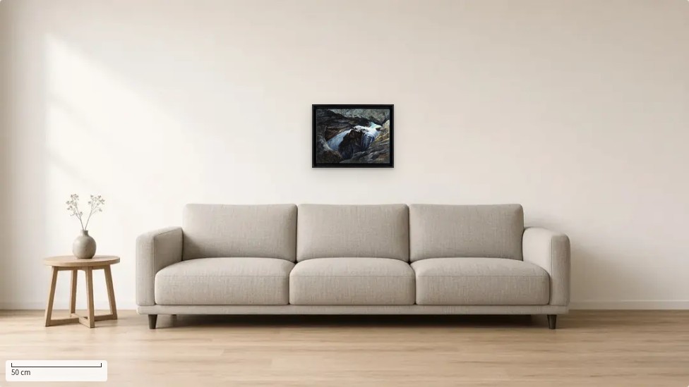 |
| Unexpected light — Guiers Mort, oil on wood, 35 × 45 cm, seen “in your room” (the “See it in your room” sample living room, to scale). |
| A painting is only really judged on the wall. On every shop page, the “See it in your room” button shows the work to scale in a living room, a dining room or a chalet entrance, and you can even try a photo of your own wall. Shown here: Unexpected light — Guiers Mort, oil on wood, 35 × 45 cm, €480.00. |
| See the work: joseph-sherriff.com/en/products/light-in-the-dark-grotte-tableau-original-huile-bois-chartreuse. Originals painted in the Chartreuse are available in the shop: joseph-sherriff.com/en. |
|
| Thanks for reading. |
Joseph E. Sherriff
Atelier Joseph Sherriff · Saint-Pierre-de-Chartreuse
joseph-sherriff.com
Instagram: @j.e.sherriff
joseph.e.sherriff@gmail.com · +33 6 45 76 97 36 |
|
|
|